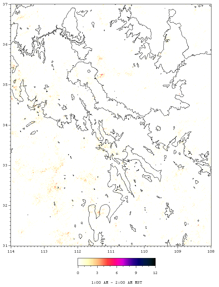
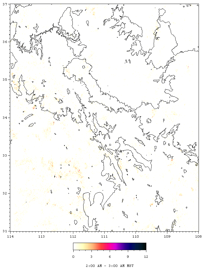
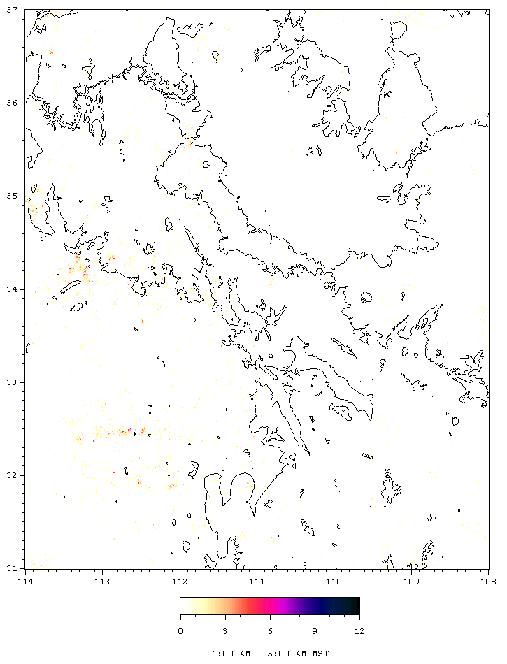
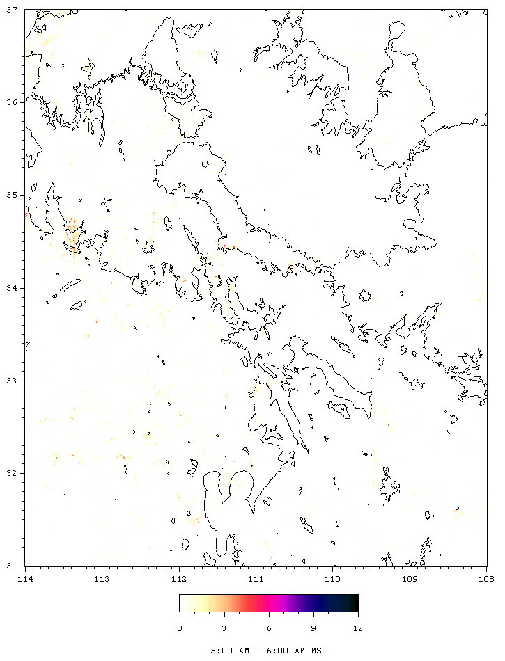
Lightning Topography - Diurnal Cycle
This section investigates how the pattern of lightning
evolves over an average day. All the images in this section are lightning
topography maps, similar to those discussed elsewhere at this site, with
the exception that each image only covers lightning for a single hour of
the day. The numbers plotted are still simply the totals of all strikes
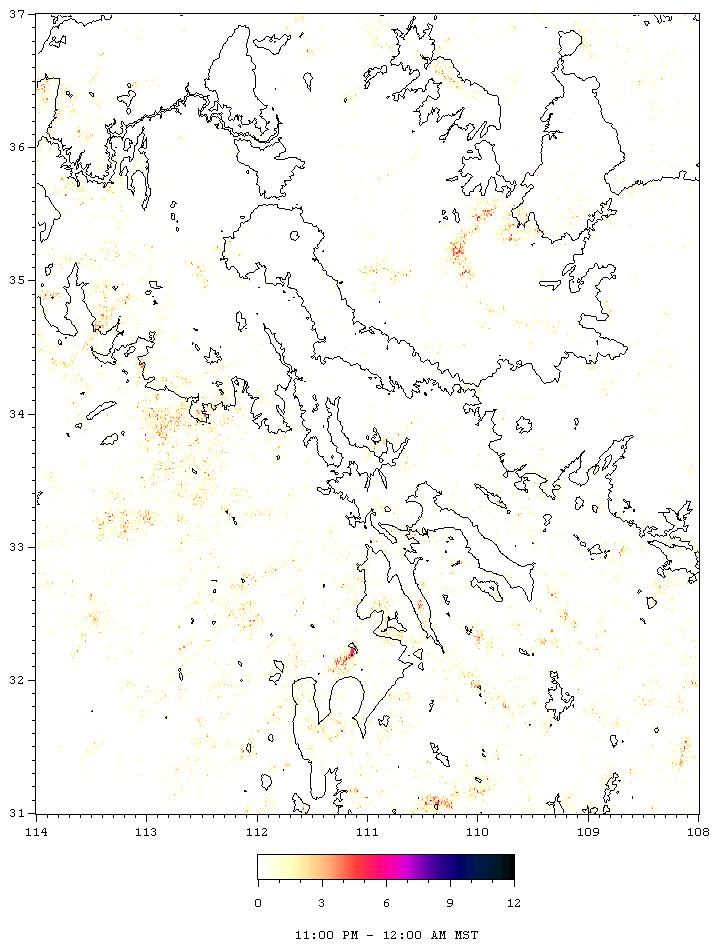
for July and August for the five years of 1995-1999, added up in 0.01 degree
latitude by 0.01 degree longitude bins. Again, this is approxiamately
a 1 km resolution. Separate images are made for all the strikes that
occured from 1:00:00 PM to 1:59:59 and for all strikes that occured 2:00:00
PM to 2:59:59 and so on. Putting these together yields an animation
of the progression lightning pattern on the average.
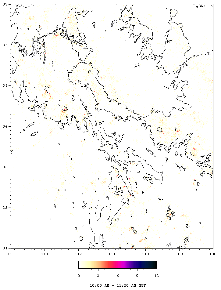
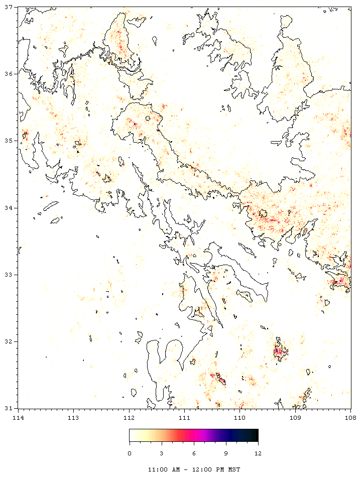
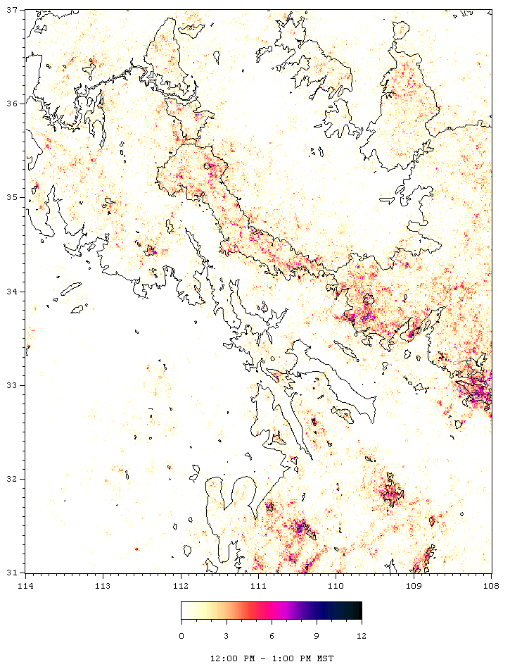
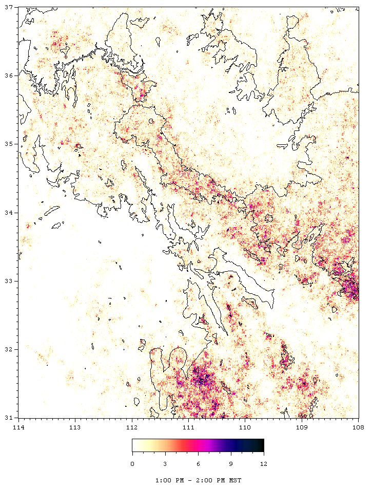
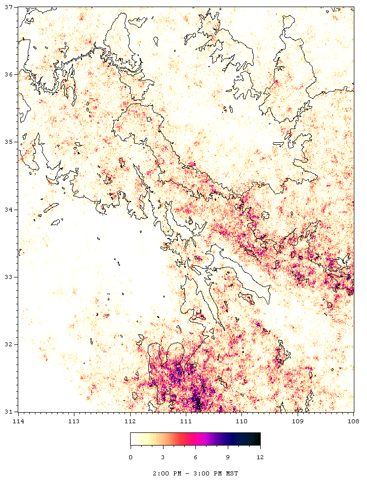
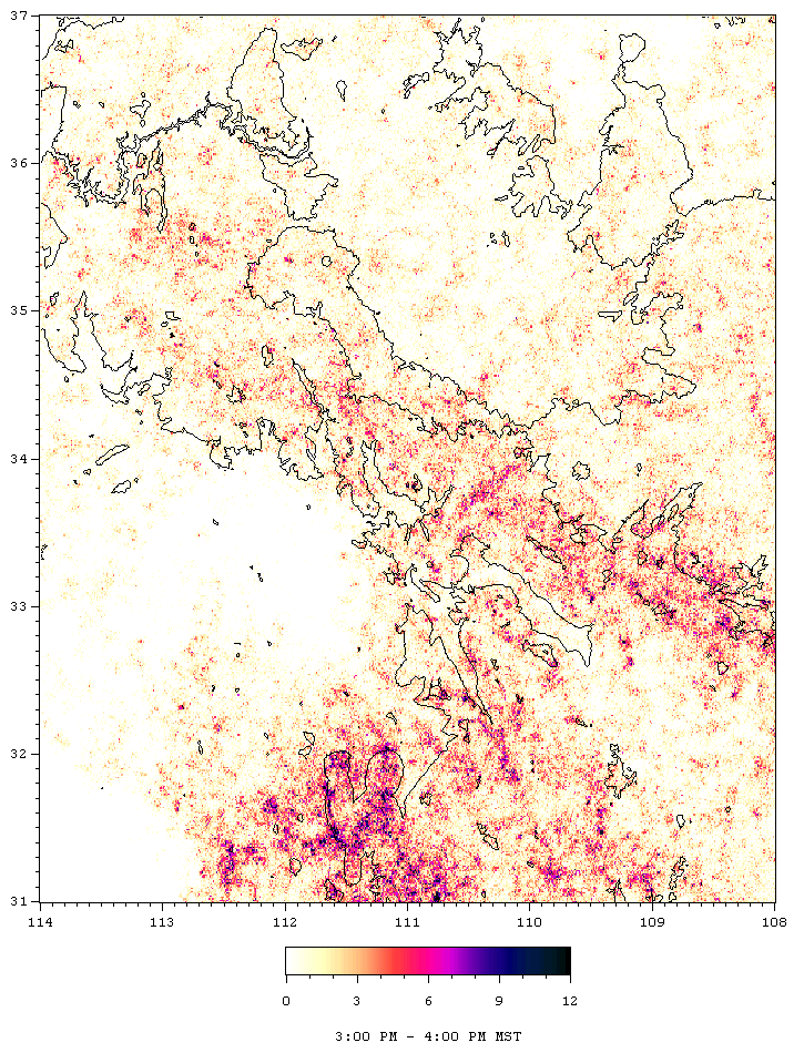
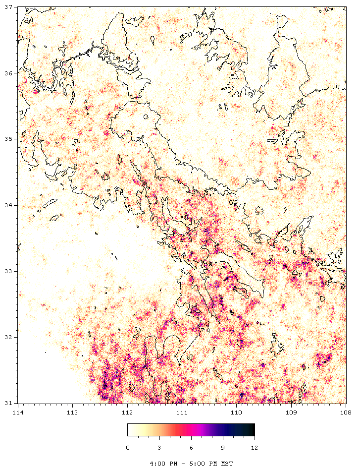
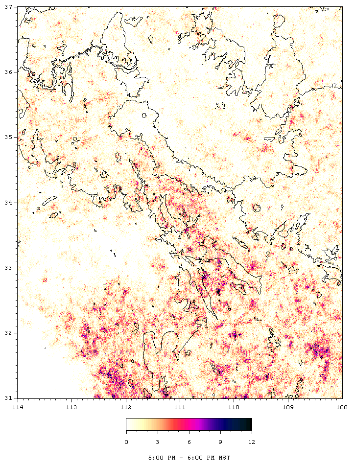
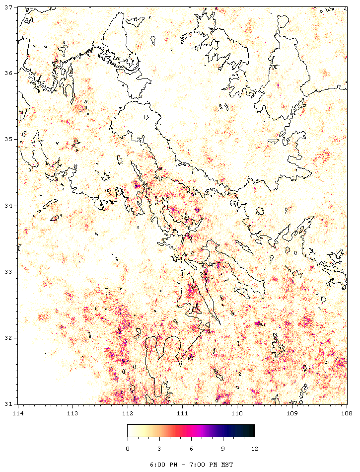
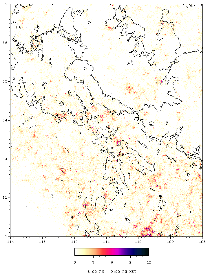
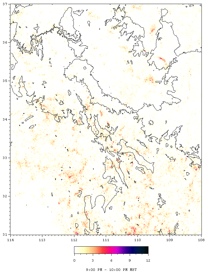
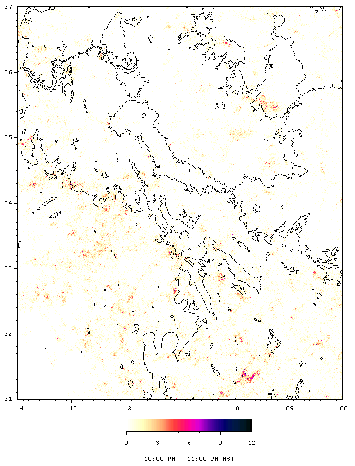
The sample below covers the entire 72 quad region
of study. It does not cover the whole 24 hour period, but runs from
10:00 AM to 10:00 PM, which includes the most active part of the day.
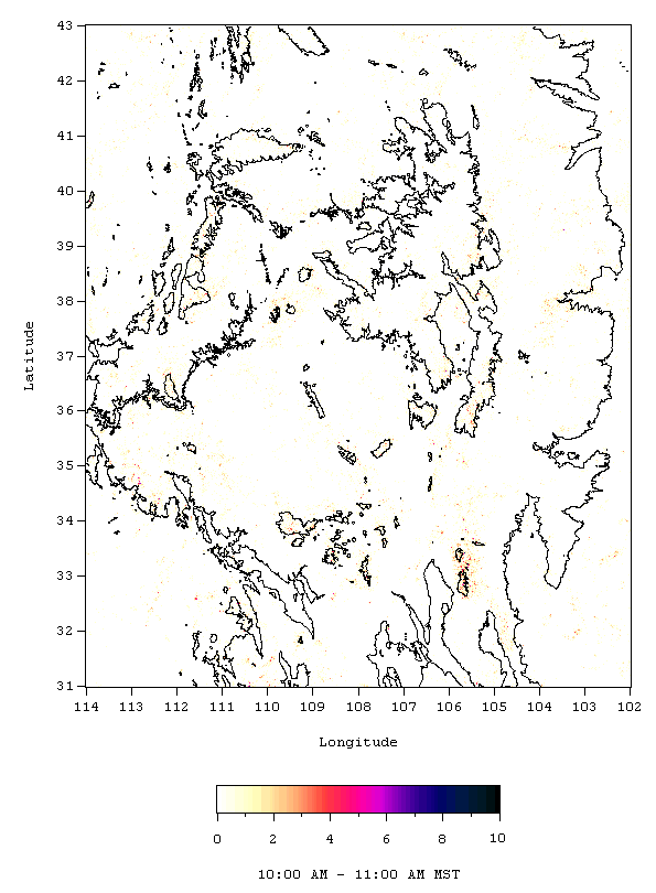 The same color bar is used for all of the frames. Each grid
rectangle is close to 1 km by 1 km so a value of 10 means ten strikes in
five years or about 2 strikes per square km per year. This is a rather
high value, considering that it only covers one hour of the day.
10 was not the highest value observed. In the afternoon hours, over
the mountains, values as high as 20 were seen. However, using a color
scale that runs from 0 - 20 would greatly fades the low end of the scale,
where a lot of the data resides. The grid locations with values over
10 are small in number and isolated so the choice was made to sacrifice
discrimination at the very high end so that the low end has more contrast.
Any data point over 10 is also be plotted in black.
The same color bar is used for all of the frames. Each grid
rectangle is close to 1 km by 1 km so a value of 10 means ten strikes in
five years or about 2 strikes per square km per year. This is a rather
high value, considering that it only covers one hour of the day.
10 was not the highest value observed. In the afternoon hours, over
the mountains, values as high as 20 were seen. However, using a color
scale that runs from 0 - 20 would greatly fades the low end of the scale,
where a lot of the data resides. The grid locations with values over
10 are small in number and isolated so the choice was made to sacrifice
discrimination at the very high end so that the low end has more contrast.
Any data point over 10 is also be plotted in black.
It should also be noted that the grid rectangles,
which are 0.01 degree latitude by 0.01 degree longitude, are not all equal
in area. Therefore the colors are not quite proportional to lightning
density. This effect is fairly small however, amounting to about
a 10% enhancement of the south end of the map relative to the north end.
This would for instance make a '7' at the top of the map correspond to
the same lightning density as about an '8' at the bottom of the map, but
it can be seen on the color bar that this is a fairly subtle difference.
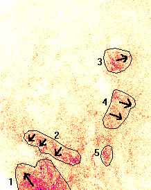
The above animation shows important genesis areas
for thunderstorms and some large scale general movement trends. It
also makes for a good comparison of the relative strength of any signal
compared to other areas. About 5 major areas stand out as active
lightning regions. These are highlighted on the image below, along
with the average direction that motion/development occur.
Diurnal Animations and Frames Listing
Arizona Region: [31 N - 37 N, 114 W - 108W]
Full 24 hour Animation
[1.74 Mb]
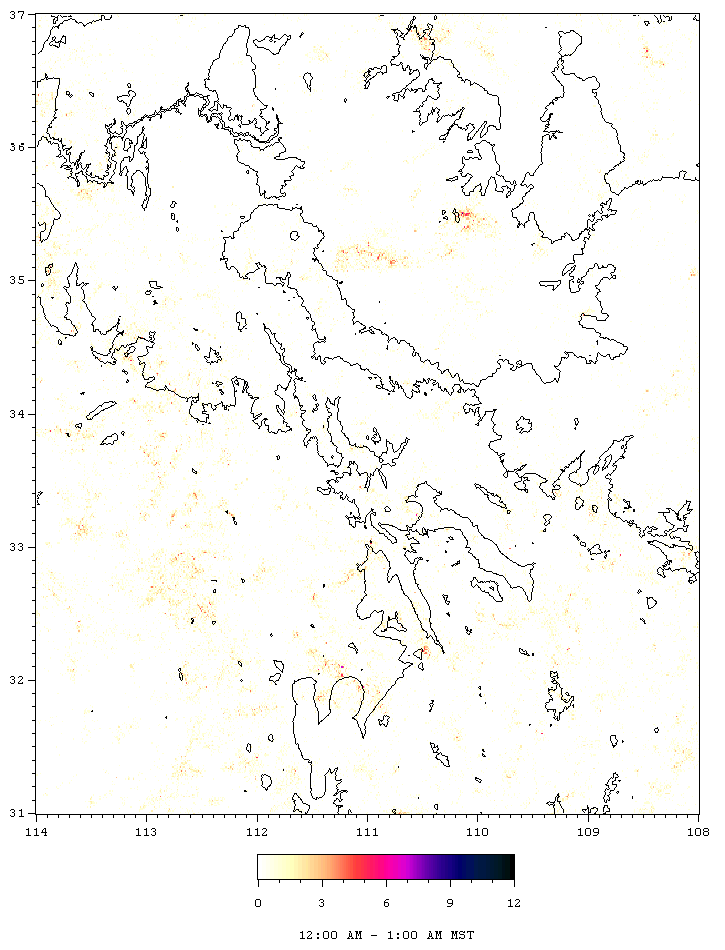
12:00 AM Frame
1:00 AM Frame
2:00 AM Frame
3:00 AM Frame
4:00 AM Frame
5:00 AM Frame
6:00 AM Frame
7:00 AM Frame
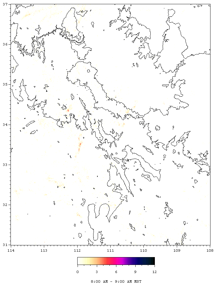
8:00 AM Frame
9:00 AM Frame
10:00 AM Frame
11:00 AM Frame
12:00 PM Frame
1:00 PM Frame
2:00 PM Frame
3:00 PM Frame
4:00 PM Frame
5:00 PM Frame
6:00 PM Frame
7:00 PM Frame
8:00 PM Frame
9:00 PM Frame
10:00 PM Frame
11:00 PM Frame