The three plots of total strikes, total area and strike density versus elevation form a natural grouping. This trio of plots has been done for all 72 quads in the study region. A key ingredient in generating these plots is the NLDN dataset of strikes, augmented with an elevation assignment for each strike. Details of how this assignment was made is discussed elsewhere in these pages under Data Source Discussion for the Lightning Strike Maps. Once the elevation for each lightning strike is determined, the variation with lightning density with terrain can be investigated.
Tucson Sample:
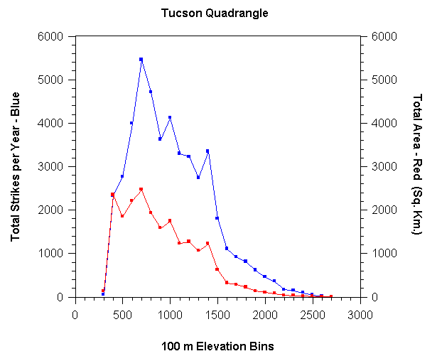
The first image below shows a sample for the Tucson quad.
The blue plot is the total number of strikes for July and August added
together and then averaged for the entire five years (1995-1999) of the
study. The plots were totalled in elevation bins of 100 m.
The count for a given range is plotted against the lower bound of the range,
so for instance, the point plotted on the 300 m mark on the horizontal
axis gives the total strikes in the 300 m to 399 m range.
The red plot in the above image shows the total area in square km at
each 100 m elevation bin. The shape of these areas is usually torturously
serpentine, but the area was calculated essentially by a trivial numerical
integration. The highest resolution elevation data was used.
This gives an elevation value for every rectangle in a 3 arcsec latitude
by 3 arcsec longitude grid (3 arcsec correpsonds to roughly 100 m distance).
The whole rectangle is treated as being at the same elevation and it's
area is added to the total. The decreasing width of these rectangles
going from south to north is taken into account. Again, the 300 m
data point shows the total area of terrain with elevation of 300 m to 399
m.
The numbers on the total strikes axis are
just the average total counts per year. The numbers on the area axis
are in square km. However the two scales are given the same numerical
values in all the plots so that places where the blue and red curve cross
correspond to 1 strike per year per sq. km. As the blue curve gets
higher than the red curve, the strike density increases. Note in
the sample above, the blue data point is just below the red data point
for the very first bin (300 m), they are about equal in the next bin and
then the blue curve eventually doubles and triples the height of the red
curve (although they both decrease at the higher elevations.
The strike density is just the value on the blue
plot divided by the value on the red plot. These densities have been
plotted in a separate set of plots. The sample below is also for
the Tucson quad. Again, the strike densities are for July and August
added together, but then averaged over the five years.
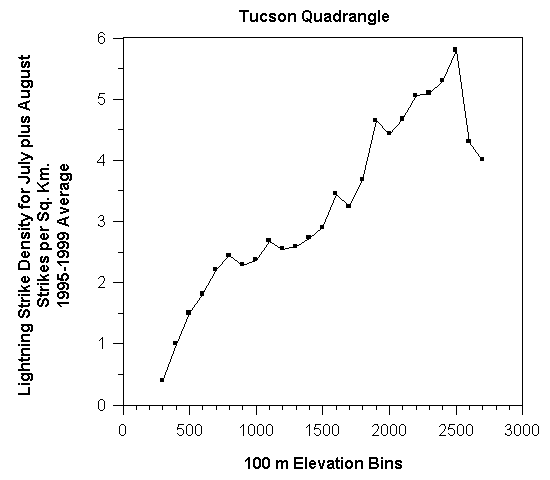
Even though the actual number of strikes is quite small in the top several
bins, the amount of area is very small as well and it can be seen that
the strike density clearly increases with altitude. In this
and many other quads there also appears to a slight tendency for the strike
density to peak just below the very highest one or two elevation bins.
One factor that complicates such an observation is that the density values
become significantly more volitale toward the very top of the scale.
As the area gets very small, random fluctuations in the number of strikes
can have a larger percent effect. The top bin might only have 0.4,
or 0.2 or even 0.1 square km. An area that size might only get one
or two strikes, or none, in a season. A change of one strike changes
the strike density per square km per season by a huge percent.
The strike denisty plot above has a lot of fluctuations
that have the appearance of random noise. However, it can seen by
looking at the data year by year that many of the peaks and valleys occur
in the same places on an annual basis, suggesting that they are tied to
topographic features of some kind. The image below shows the same
strike density data for Tucson as the previous plot, except that the contributions
from each of the five years is plotted separately.
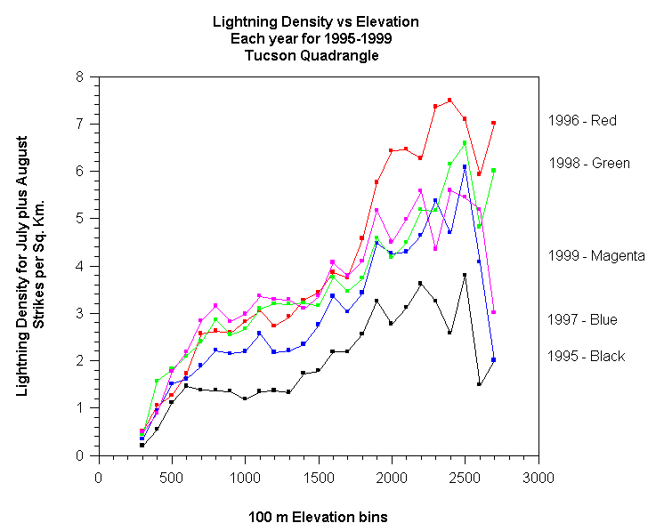
Note the peristence of peaks at 800 m, 1100 m, 1600 m, and 1900 m.
There is a signal here that appears in even a single year most seasons.
The erratic nature of the values for the highest elevation bins can also
be seen. Year to year changes in the overall pattern can also be
seen. Note that 1999 was the most active lightning year in the low
to mid elevation range of 600 m to 1300 m (which are the largest regions
in terms of total area) and yet 1999 was eclipsed by both 1996 and 1998
at the highest elevations. 1996 in particular was a very intense
year for storms on the highest peaks.
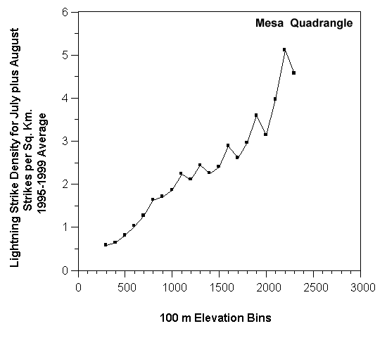
For another example consider the Mesa quad shown
below. This is also a plot showing the year by year pattern.
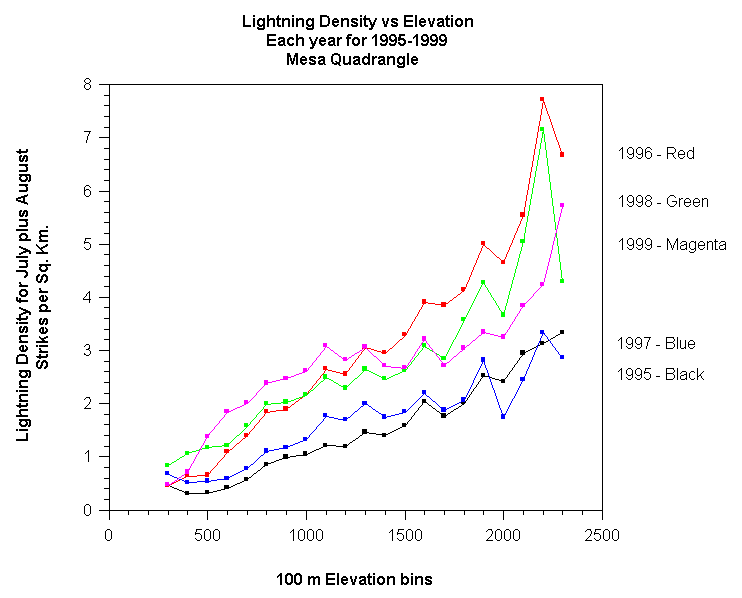
There are recurring peaks again (this time at 1100 m, 1300 m, 1600 m and 1900 m). The highest bin shows the greatest volatility. In this case, 1999 stands out even more as a different pattern; being the most active year in the lower deserts but only an average year in the higher mountians.
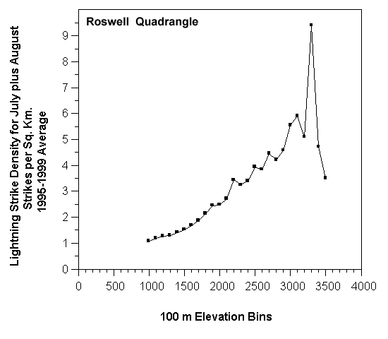
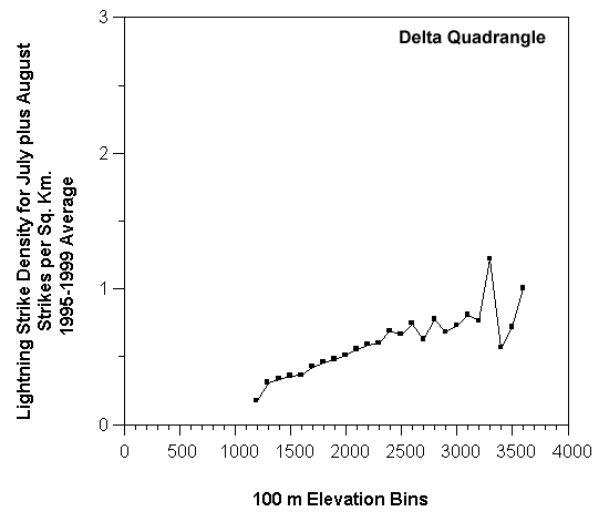
Results from Selected Quads:
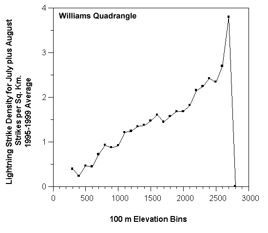
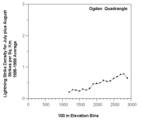
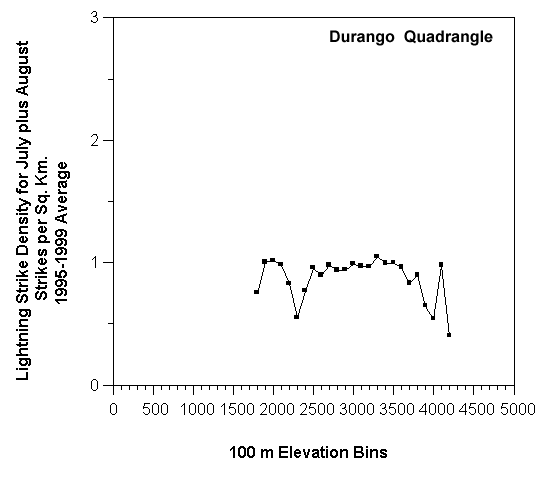
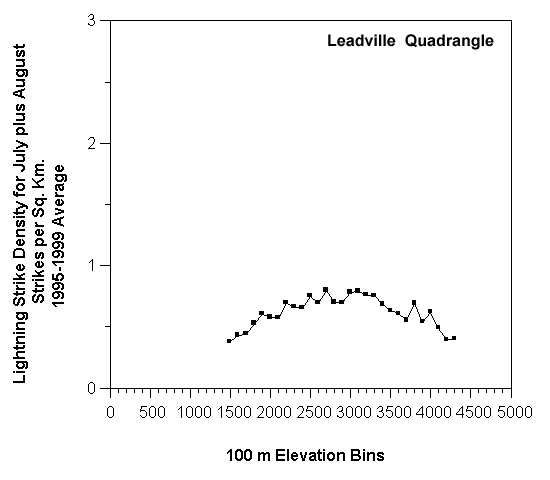
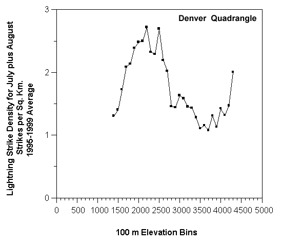
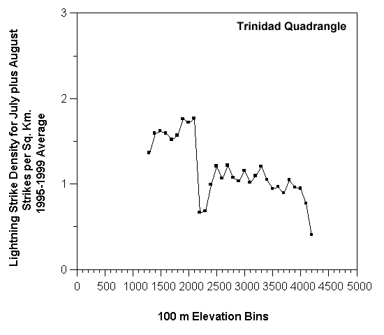
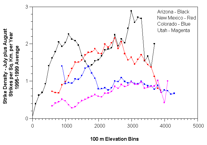
Over the 72 quad region, a variety of different regimes
are seen. One feature to keep in mind is the volatility of the last
one or two bins. The next image shows an extreme case, but one which
is seen several times in the plots. This is a plot for the Williams
quad: